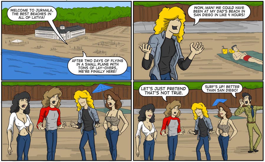
The backgrounds on this one wore me out. I wish I had more time to work on these!
This one is for all those folks who suddenly realized after working on something for hours, that all you had to do was something really simple… like the first frame of this darn comic. I did it three times before just doing a simple fill. Ugh!
Enjoy!


Yeah, everyone has to make their own peace with backgrounds. Some folks use abstract shapes or colors to suggest what’s really there, others (like me) use a variety of set pieces they can push around for new combinations to build other places, some have no backgrounds at all, and some crazy people put just as much time and detail into backgrounds as they do the main action. (Those are usually the guys angling for a job at Marvel.)
I like the level of background you have here. Overly detailed backgrounds compete for the focus and can leave your strip confused. These are nice, easy to read, and don’t compete. The best background is one that the readers don’t even notice, they just pick it up as part of the story.
(Love the beach house tho!)
I like the background – good job! Without putting in too much detail in, you can still see that you pulled the actual architecture that’s there. 🙂
Nice!
I did a bunch at 60%, and some even at 40%, when I was doing B&W, but I pretty much dropped all of that when I went to color. I keep a 7 point stroke around the main action, (in a very light yellow) that more or less trains your eye where to look.
BTW, in case it got missed, this was a funny comic too. 😉
Beware of blue green algae and sewage soviet era sewage treatment is hardly the best but enjoy your sour kraut and sprats with vodka maybe their are topless girls for Bud and Jeff.