Man, Christmas is finally over! Now to get ready for the New Year’s Hang Over. Rock on, man.
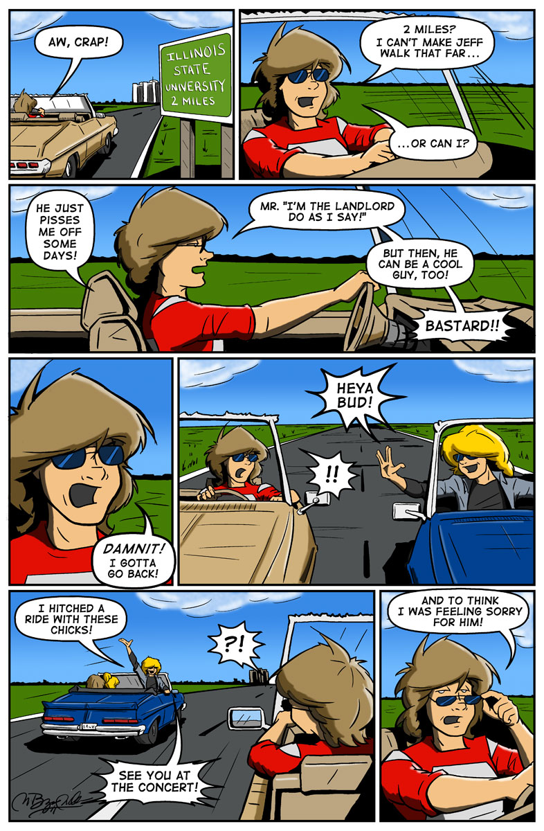
One of the things I’m liking about the new one-page format is that I can get in more dialog and bring out some more character personality. Roommates never get along as well as Jeff and Bud do, so at some point it is necessary to show that conflict. But, in small 3 or 4 panel strips, it is hard to do that without making the dialog run over two or three panels… which I find annoying. So, this format gives me the room I need to stretch out the characters as well. I hope you enjoy it too!
A fitting song for today is Boston’s “Hitch A Ride” from their debut album. It is by far one of my favorite Boston songs next to “Smokin'”. The guitar solos at the end just give me a nice buzz, plus they’re double tracked so Scholz had to play them twice. He’s known as a perfectionist, so I imagine it took a few tries to nail it the way he wanted (or maybe a decade at the rate he records albums).
****************************
Good job on the comic!
And I agree, this year has been an awful one for me, so I too am glad to see the back of Xmas, but for all bad reasons! 🙁
Can’t wait for New Year either, so I can say good-bye forever to 2010!
Oh well! Onwards and sideways!
Well, at this point, life could get a lot worse (though it is hard to see how sometimes) so I’m holding my head up high this year and pushing ahead with the comic and other things in my career. I can’t solve the world’s problems, so I might as well focus on me.
I hope the best for all my readers in the coming new year!
The new page format really fits. Can’t wait to see how it develops.
Thanks man! Means a lot coming from you!
I’m getting my chops going on this format. It seems to fit me better than the 3 or 4 panel standard strip. I find it easier to write and draw them (though it takes a lot longer to draw these pages). I’m hoping with the new iPad app I’ve got coming that this will make it easier to read and publish on these new e-readers.
Kinda saw that telegraphed before the middle of panel #2. I suppose that Bud’s got extra room in the car for lost ‘n lonely hitchhiker chicks now. The real tell is: who makes it home? Or not. And the reasons why. Who’s in possession, I think, will determine much. 😉
An epic roadtrip tale in the happening. Glad to be along for the ride! 😀
‘Who’s in possession, I think, will determine much.’
Possession is nine-tenths of the high, y’know 😛
Heh, Boston – I saw a film the other day with plenty of Boston in the soundtrack (and referenced in dialogue), The Men Who Stare at Goats. Funny film, highly recommended!
Of course Jeff got picked up by the lay-dies. He’s hawt!
Never saw that film, so I’ll have to go check it out now.
One of the things I miss now with the bad economy is being able to see movies on a regular basis. I’m lucky to see two or three in a year. But, when it costs nearly $50 to take the family to the movies… I have to decide if I’m going to fill up my van so I can drive to work or blow it on a 2-hour movie. Yeah, the van wins each time.
There are “alternative” methods to seeing these films, so I may have to check those out at some point.
😛
Yay for alternative methods! The internet is your friend 🙂
Having had a crap year ourselves, the only time we can even consider going to the cinema is on ‘cheap Tuesdays’, when the ticket price is merely offensive instead of outrageous.
Man, Byron, your artwork looks so clear and vivid. I see you’ve gotten rejuvenated and have come back to the game with an incredible second wind. 🙂
Seconded!
Thanks, George! By doing it once a week, it’s allowing me to concentrate on both the story and the art. Rushing three strips a week was not helping my sanity nor my art as I was doing whatever I could just to get them done and a lot of times I was not happy with the end results.
Now, I have no excuses. If I’m not happy now, then I take the time to make it right. Or at least try!
🙂
I love the last panel. lol That is what.. the second time you had a character break the fourth wall? With actually talking this time though. Sweet!
And I’m fairly sure it’s been only Bud too that does that. It is *his* story after all…
😛
yea true true
That’s how it always goes with dudes like Jeff. the minute you give them compassion, they do some stupid crap to make you question why…
I had a few acquaintances like Jeff. Lucky son’s of bitches that irritated the hell out of you and just when you were ready to pound on them, they’d do something really, really nice for you then you’d have to stop and think “Why am I holding a knife to his throat again?”
Ah, the old days… 🙂
ARRGH!!!! I was going to comment on your website’s nice new buttons and colour scheme, but then I looked at the comments – and they’re invisible without highlighting each one! Noooooo! DO NOT WANT!!! Dark text on a black background is FAIL. Plz to tweak?
Also, a very happy New Decade to you!
Holy crap… what browser are you using? I test in Firefox and IE and I have no issues seeing the comments or the site.
Let me know what version you’re running too.
Blimey! ‘k, I normally access 1977 via Konqueror (which you probably won’t know, it being a Linux thing), but I just tried it on Firefox and the dark-text-on-dark-background is the same there too. I’m using Firefox 3.5.11 because the newer ones suck root 😛
Out of curiosity, what are *you* getting on your browser(s)? Surely it’s not supposed to be what I’m seeing…
‘k, I’ve just emailed you a screenshot of what it looks like…
BTW, it’s now 107F in the shade here (but there’s bugger-all shade), and the afternoon’s barely half over. Oh, for some nice freezing winter…
This is what you should be seeing:
https://1977thecomic.com/images/Firefox-screencap.jpg
You should see blue backgrounds on the sidebars and a light-gray behind all the comments. I’ve heard of your browser, I just don’t test in it. I test Firefox and IE as they make up over 85% of the browsers that hit the site. I also test the site on iPads.
So the new Theme is messing up somehow. I’ll have my CSS guru look your screen-shot over.
Thanks!
Anyone else having issues seeing the site?
The ever amazing Phil Hofer (Frumph) has helped me tweak a couple style.css settings and you should be good to go.
Let me know when you can. THANKS! A shiny new dime is headed your way… if it gets through customs…
Whew, that works now! Thank Phil for me – and thx to you for getting on it so fast. And a very happy new decade to all!
Looks like Jeff has gotten the rule for all Hitchhiker’s to remember: DON’T PANIC!
Is there any significance to the wave Jeff uses in the fifth panel. i.e. the vulcan “live long and prosper” sign?
Jeff and Bud are both kinda geeky and would watch Star Trek. With Star Wars being so big in 1977, Jeff would be the type to remind everyone of Star Trek by doing the Vulcan “live long” sign to Bud. It’s also his way of teasing Bud.
😛